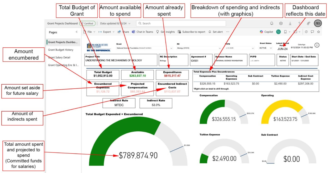
Quick link back to graphic above (dashboard is reflective of month-end management reports). You can look at a dashboard for each individual grant. Like a physical dashboard with dials, gauges and indicator lights, the financial status is shown as dials which color communicate general health of the grant.
- Red = overdrawn [not shown]
- Yellow = funds close to being spent out [>90%]
- Green = general good health
This tab shows key overview data such as grant title, the grant number, the grant status, the grant start and end dates, the budget line, the actual expenses, and the available balance.


